
Women Make Waves International Film Festival Social Media Campaign
Description
Women Make Waves International Film Festival is one of Asia’s major international film festivals and the second longest-running film festival in Taiwan, supporting female filmmakers and gender equality through cinema.
As part of the festival team, I supported both event coordination and the design of digital campaign materials, including social media visuals for call-for-entry promotions and film workshop tour events.
Role
Visual Identity Development
Editorial Design
Illustration
Credits
Photography: Women Make Waves International Film Festival and featured films


The Challenges
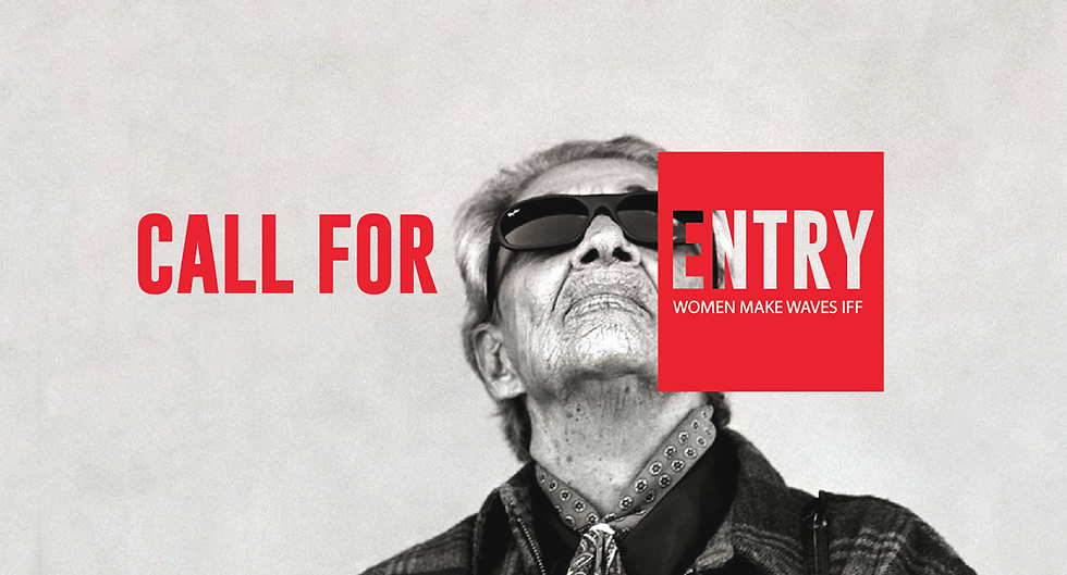
The challenge was to create social media visuals that felt more contemporary while still maintaining the festival’s artistic and international identity.
At the time, many local film festival visuals in Taiwan relied on dense compositions and typography-heavy compositions. I wanted to explore a more restrained and internationally influenced editorial approach that felt visually modern and worked effectively across digital platforms.
Strategy & Approach
Rather than closely following the main festival visual identity, I developed a simplified and high-contrast visual system designed specifically for digital platforms.
For the call-for-entry campaign, black-and-white film imagery was combined with bold red typography to create a strong visual impact and improve readability. The recurring red square acted as a visual focal point, symbolising recognition and opportunity for emerging filmmakers.
The layouts were inspired by contemporary editorial and international film campaign aesthetics, helping the festival feel more globally connected and visually current.

Strategy & Approach
Rather than closely following the main festival visual identity, I developed a simplified and high-contrast visual system designed specifically for digital platforms.
For the call-for-entry campaign, black-and-white selected film imagery was combined with bold red typography to create a strong visual impact and improve readability. The recurring red square acted as a visual focal point, symbolising recognition and opportunity for emerging filmmakers.
The layouts were inspired by contemporary editorial and international film campaign aesthetics, helping the festival feel more globally connected and visually current.
Strategy & Approach
Rather than closely following the main festival visual identity, I developed a simplified and high-contrast visual system designed specifically for digital platforms.
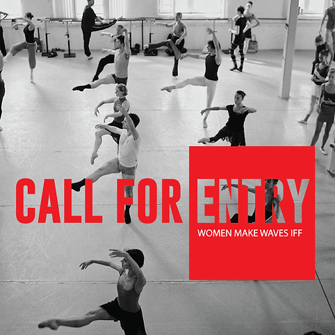
For the call-for-entry campaign, black-and-white film imagery was combined with bold red typography to create a strong visual impact and improve readability. The recurring red square acted as a visual focal point, symbolising recognition and opportunity for emerging filmmakers.
The layouts were inspired by contemporary editorial and international film campaign aesthetics, helping the festival feel more globally connected and visually current.

For Facebook event visuals, I intentionally reduced excessive informational text on the cover images. Since event details were already displayed within the platform interface, the visuals focused more on cinematic atmosphere and emotional storytelling through carefully selected film stills and photography.
Minimal English typography was also used selectively to create cleaner compositions and balance the denser visual rhythm often created by Mandarin text.
